Deliverables:
After providing an initial technical and UX audit of their existing website our research showed that improvements were needed, both internally and externally in order for the website to rank better on search engines and improve the user experience and conversions on the website. It was also agreed that the website did not provide a luxury look and feel.
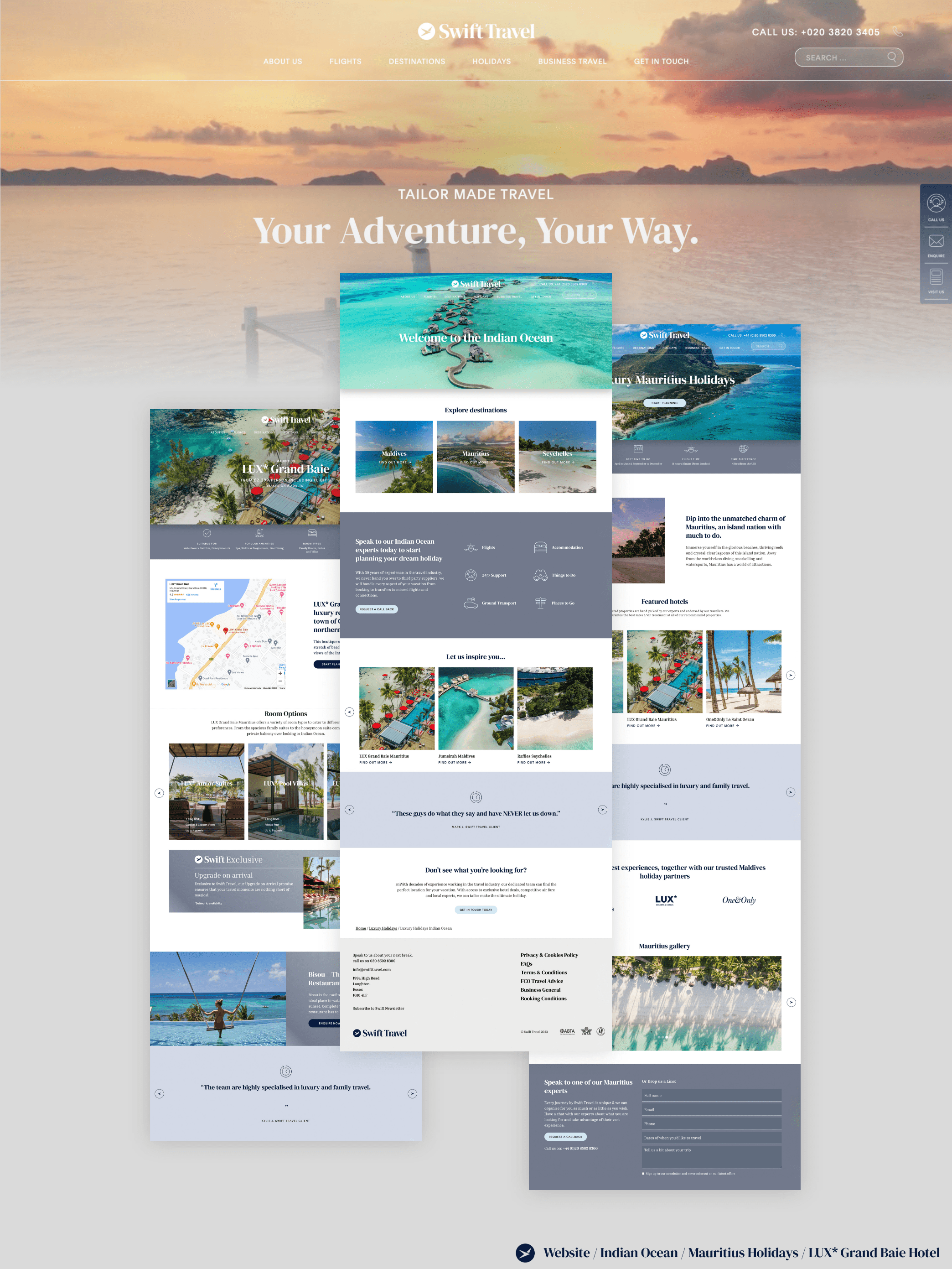
Based on the research findings, our design team crafted new designs and altered the existing structure to optimise the user journey. Special attention was given to intuitive navigation with the addition of a mega menu, which provided the opportunity to show all destinations and trip types at a glance.
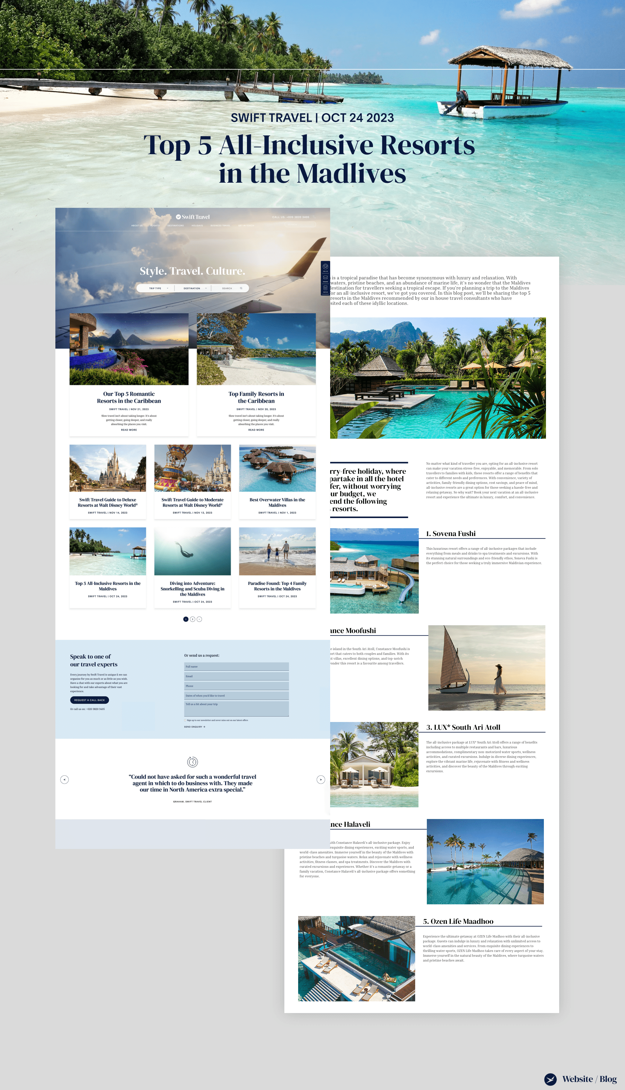
Visually appealing layouts, and strategically placed CTAs were created to guide users seamlessly through the site. Additionally recommendations to increase traffic and time on the site were made such as the addition of a blog/article area which provided the opportunity to to showcase their in-dpeth knowledge of creating bespoke trips.
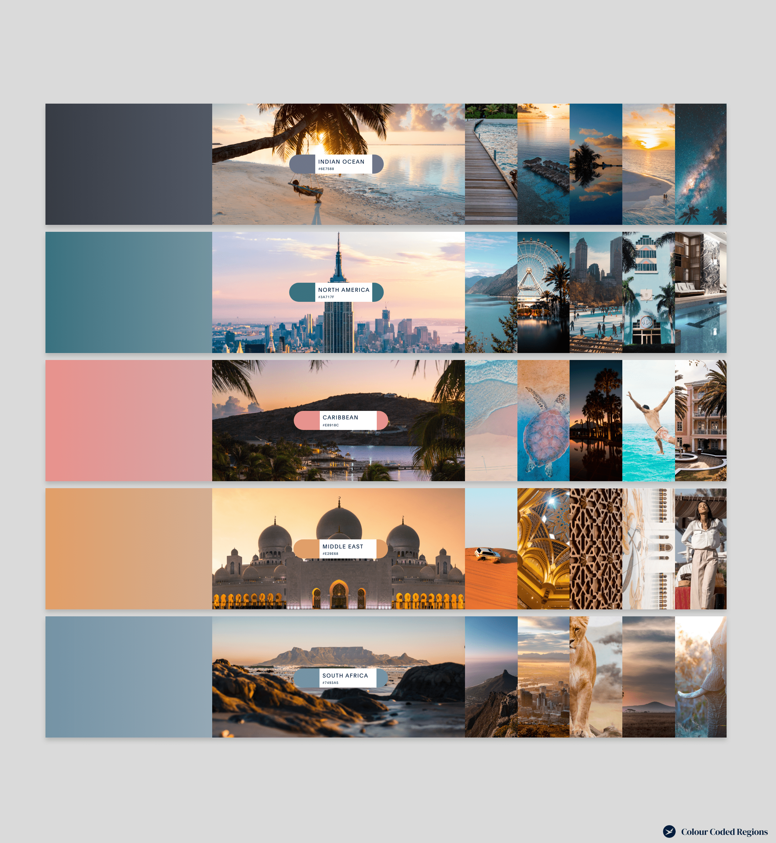
The visual identity of the website was enhanced to reflect the luxury and exclusivity associated with Swift Travel’s offerings. High-quality imagery, engaging content, and a cohesive colour palette for each region/country were used to create consistency.
The development phase involved the implementation of the approved design and responsive design principles were applied to ensure optimal user experiences across various devices. See the new website here.
Our SEO team conducted extensive keyword research to identify relevant terms and phrases related to luxury travel. Each page was meticulously optimised, ensuring a seamless blend of user-centric content and search engine visibility. Meta tags, headers, and alt attributes were optimised for maximum impact.
Swift Travel faced challenges in delivering targeted and visually appealing email campaigns and they needed a solution that aligned with their brand identity. Additionally, they sought an email marketing strategy that would resonate with their audience.
Our recommendation was a transition to a robust and scalable email marketing platform with advanced customisation features, analytics, and automation capabilities, ensuring a seamless and efficient email marketing process.
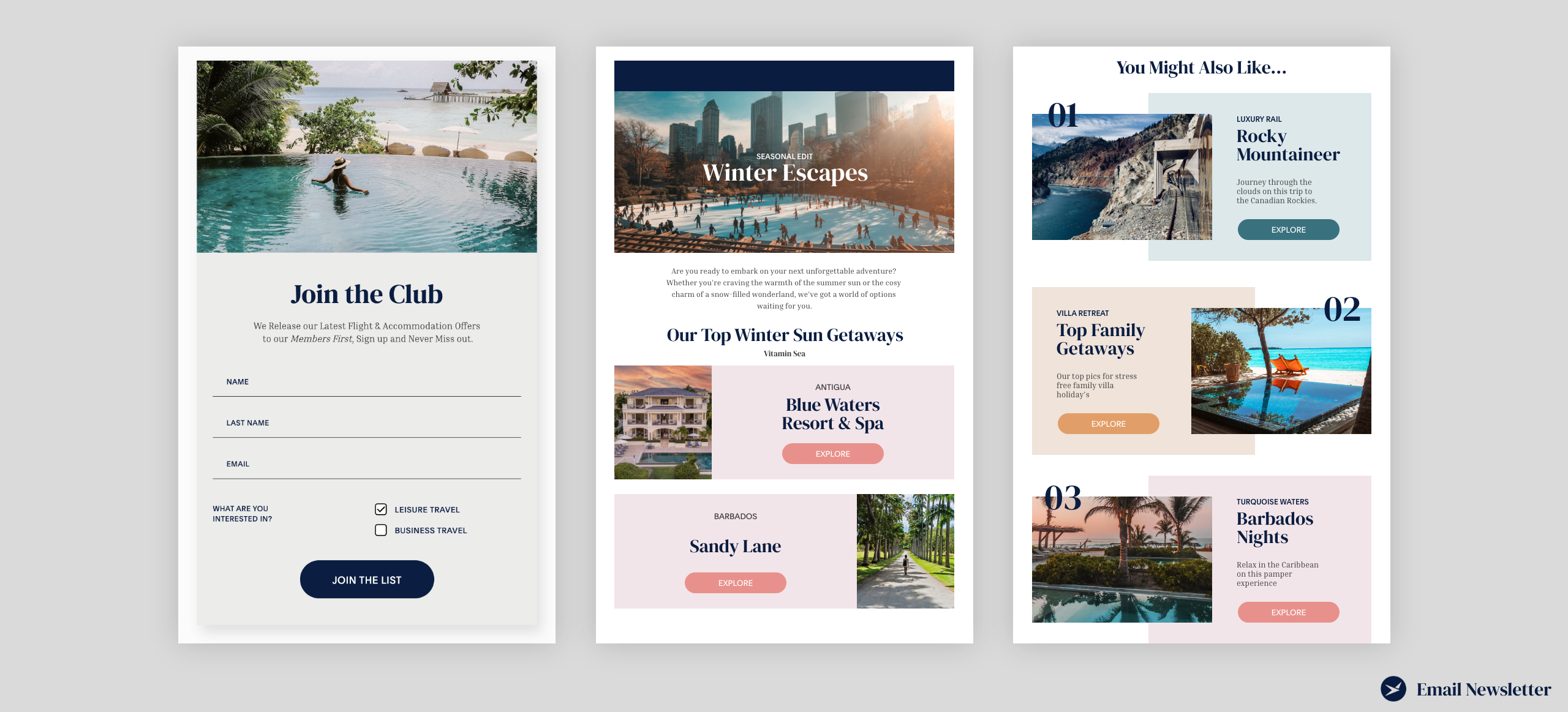
To align with Swift Travel’s brand identity, we provided visually appealing and responsive email templates within the platform which incorporated the brand’s colours, fonts, and imagery, creating a consistent and professional look across all communications. The templates were designed to be user-friendly, allowing Swift Travel’s in-house team to easily customise and deploy campaigns.
We worked closely with Swift Travel to identify key topics that would resonate with their audience. These included travel tips, destination highlights, exclusive offers, and customer testimonials. A tailored frequency was established based on industry best practices and Swift Travel’s specific goals.
We saw organic traffic double very soon after the relaunch of the website with new keywords ranking over the following weeks. The newly created CMS enabled the Swift team to easily add new destinations, cities and accommodation to the website when required.
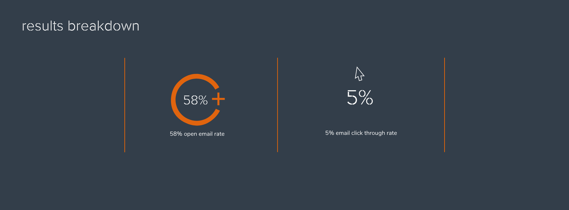
Having sent out the first newly designed email communication we were pleased to see well above industry averages for both open and click through rates.
